I just recently made an edited cover for my story as a demonstration, but now I have 3 covers. I’m stuck on which is more appealing to readers or most appropriate for the story, so I’m hoping to get your opinions.
Which one below do you like better?
First
Originally a Webtoons cover that I used as an easy fix for a novel cover.
Currently in use
Pros:
- Completely my art
- Girl is a mostly correct image of FL
- Outfit is correct
- Green earring is a subtle highlight (important to story)
- Fills up the space
Cons:
- Not really made to be a book cover (the title is teeny/hidden by the Original tag)
- Girl is the first attempt at semi-realism from over a year ago, so it’s pretty mediocre
- Only appealing to females?
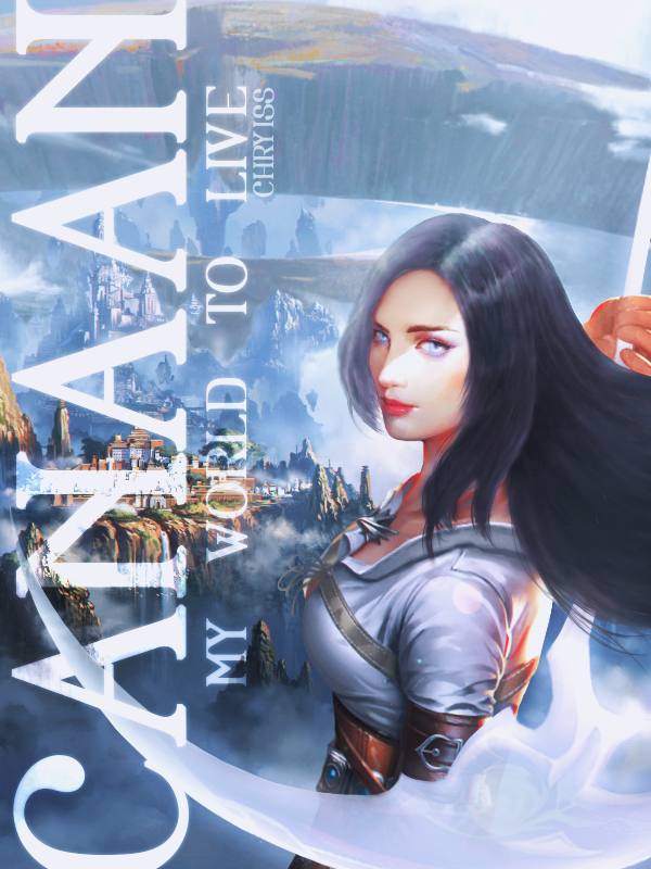
Second
Since the first felt like it would only appeal to females when the book is catered for all audiences, I made a gender-neuteal minimalistic cover.
Pros:
- Completely my art
- Simple for all audiences
- Sword is actually a part of the book
- Includes larger series logo
- More suitable as a book cover
Cons:
- Too simple or amateruish looking?

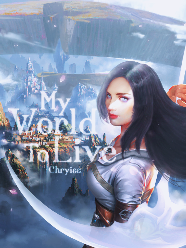
Third
Just edited this today; it took way longer than expected as I overshot myself. I used 6 images and about 5 times as many layers, and I had to draw in a lot too. (The girl was made from 3 different images ><)
Pros:
- Looks more professional (‘cause the art wasn’t crappily made by me).
- Only one to include the shorter alternative name for the series while including the logo.
Cons:
- Her outfit it totally wrong, but ok enough.
- The girl isn’t completely correct as the FL doesn’t really wear makeup and her body is more shapely than it should be (although I corrected the original image somewhat, and it might be due to the pose)
- The scythe design is somewhat wrong.
- The landscape isn’t completely correct (it’s also oddly a spoiler for the next arc which it does match better lol).
- Not originally my artwork; can’t keep using forever (if I ever manage to commercialize it).