ImBloo no can do. details are meant to be obscured-- this way, enough contrast is created that the text shows up properly. the added textures also allow there to be a focal point, which is his face & the text, and when making graphics, it is important to have a focal point-- otherwise, the graphic will not convey its meaning properly.
as for the text, gunslinger is too long of a word, so I have to cut it in half unless you want the word to be super tiny and smaller than "of the".
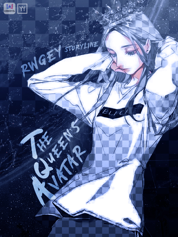
I've never used the "lightening effect" (as you so call it. they're actually cracks) in any other cover I've ever made, and as for "broken glass", I've only used it in one cover before. (e.g., this one) lighting textures, meanwhile, are just my style, and you should've known to expect if if you are requesting from me lmao. plus, once again, the create the contrast and depth as necessary.
and, as mentioned in the original post,
yaoyueyi No redoes. This is just my policy because it takes too much time and I would like to get to as many requests as I can. If you don't like the poster, feel free to not use it.
I know that these are not necessarily "redoes", but they are still a lot of things I need to edit and it will be a pain. plus, even if I could edit it, I wouldn't for all of the above reasons. it's just my style. you don't have to use it if you don't wish! :)