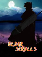
Myumara I see. however, if you use the original colors from Naruto, it is suggested to have the background elements carry the same scheme-- a sunset would be much more suitable and matching, giving it a more balanced and unified look. contrast is good, but too much contrast makes it look like text was just slapped on a picture, which isn't the best effect!