yaoyueyi
Hello and thank you very much for your time! I really appreciate the effort!
TBH I much prefer this one you did before the overlays, filters, blurs etc were added in.
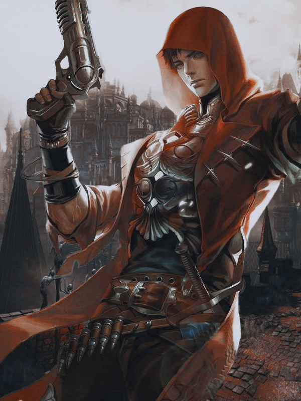
It's a lot more vibrant and I can see cool details on the outfit (such as the armor and the ammo belt). The sword on his left hip seems to be broken, but it doesn't bother me much.
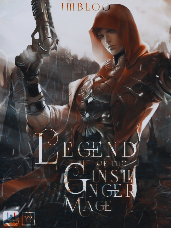
The finished version is rather muddy and uhh, I don't know, generic? The heavily saturated (is that the right word?) color and the "sunlight" (I don't know what it's called) effects have been used in a lot of covers, as have the "broken glass/ lightning" effect. They just obscure what I consider an already decently designed character. Or perhaps it's just me and my poor aesthetic sense :P.
If it's not too much trouble, could you use the STEP 3 image and add the title on it?
And can the word Gunslinger be in one line? Not like
Gunsli
nger
If it's too much hassle, I'll just take the current version and use it. Will properly credit you, of course :). And a shout out to your novel if you want.
Again, thank you for your time! I wish you good health and. uh, lots of creative energy!