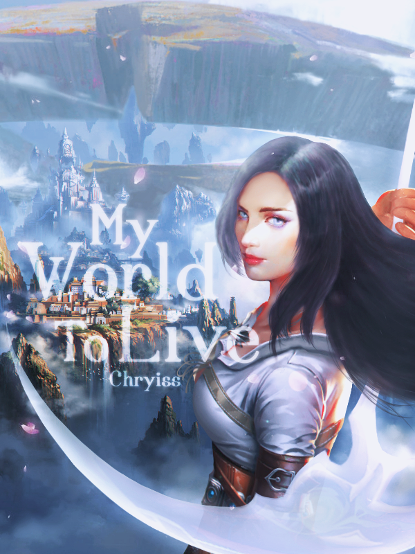
Chryiss 1st one is best.
well, technically it's not the best because it would be better if the title was actually visible, but the two other ones are not really... good. (no offense) so, out of the three, it's the best.
the second one is way too basic and looks quite mediocre. concept is alright, but execution = not so much. it doesn't appeal to female audiences at all, imo, b/c generally speaking, female audience on this site are going to interpret that as a cover for a male-lead story & they're not going to read it.
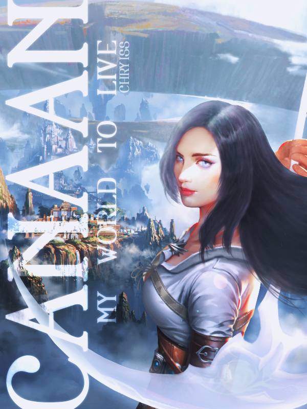
although the art for the third one is pretty, the entire cover is not balanced. the focus of the girl on the right really destroys the balance of the entire cover. the black of the author's name is okay, but the title is not. by making it just a simple black, it looks very amateurish & not at all professional because the contrast is too jarring. (an actual book cover would not look like that)
I would click the first one the most.
please don't take offense to this; just trying to give some quality feedback/criticism :cry: