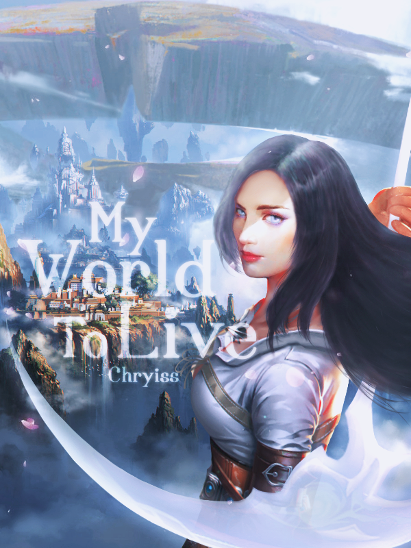
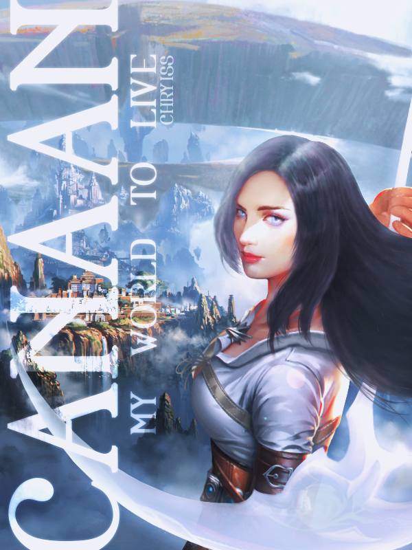
Chryiss ok, here it is. I enhanced colors for both of them because that really makes the cover pop compared to other covers & will gather more attention, but I didn't change too much of the color scheme bc I wasn't sure if you wanted that or not!
VER1: just your normal title. I also added a petal overlay on it just to add some more elements to the cover itself.
VER2: this one is with your alternative title. I made the title sideways because that would take up more space and balance the empty space on the left. also included your normal title because I feel like the readers might be confused why the title on the cover doesn't match up with the title of the novel itself. no petal texture since the text takes up so much space.
tell me if either of these work/spark some inspiration? :)
