@yaoyueyi Plez halp (also why are your covers sooooo pretty and professional reeeee) ;-;
The photoshop on the Cup of Regret one is pretty messy but really wasn't sure how to make it better or more cohesive ;-;

@yaoyueyi Plez halp (also why are your covers sooooo pretty and professional reeeee) ;-;
The photoshop on the Cup of Regret one is pretty messy but really wasn't sure how to make it better or more cohesive ;-;
Hmmmmmmmmm.....I am waiting for my roast. I want a roasted toasted boasted poasted ghoasted ROAST
Overlord_Venus Yueyi's Kitchen does not roast. We sauté, grill, stir-fry, broil, pan-sear, etc. but we do not roast. :)
So when are you gonna open the kitchen again?
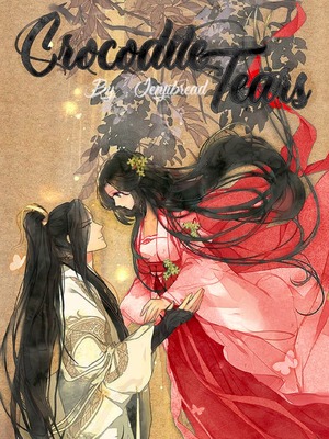
Jenjibread Damn those look awesome
Regnov Thanks but yue's are so pretty and professional ahahahah ;-;-;-;-;
Oh boy.
Okay. So, I guess, first, props to minimalism?
I'm in a time crunch, and so I just picked the first cover you had to critique (but I did look at the rest of the links you posted to give you some more general feedback at the bottom).
First things first, it's a cool base image and all, but the cover is just very, very, very dull. The colors are very bland, and the image/text are all very dim. If that's the vibe you were trying to go for, cool, but your cover doesn't really pop out at me, or really catch my attention.
So, here's the thing. It's totally okay to use not super saturated colors. However, when you're doing so, you need to make sure that there's decent contrast.
I understand that with MS, it's kind of hard to do any adjustment layers to correct your light levels, but the general idea is to make the image brighter & more contrasted. I'm sure there are some of those filters you can find online, or with basic phone image-editing services.
It's just important to make sure that the cover is eye-catching because it can definitely determine if a reader will click on it, or not. Unsaturated colors are okay, but a lack of contrast isn't as much. I guess what really bothers me the most is the shade of dark-gray cast over the entire cover. In a list of books + covers, your cover will sort of just fade into the background-- and that's not good.
Moving onto typography, you have too much spacing between your words. Try to keep the line spacing a bit more together, and it will look a lot better.
The black font is not the most ideal with how dim your image is-- I would've used white if I were keeping the same brightness of the image. It will make the title pop out a lot more.
Also, add on an author name?
This is a very simple cover in general, so there isn't much to comment other than the points I brought out above. Onto your other covers that you linked, I would say to be careful of the top right corner of all your covers. As you can see, in desktop Webnovel, the little blue "Original" label covers up some of the text you have, so I would go back and fix that.
And for Destorianaxe, the border is also not evenly spaced, and small things like that kind of bother me. The text also runs over the border. I would suggest fixing that up too.
And that's about all I have to say, gotta go run to a meeting now.
Lamb Shoulder with Citrus-Fennel Salad

Thanks for the tips, tasty tasty stuff.
Ahem just reminding the chef that we are still waiting in line for our food that we ordered Ehmm
Fuck me!! Are you Immortal !!? That's so great ::::: Cook me please