Novel Cover Tutorial/Process


Reinesse oh lol I highkey really hate webnovel translated (and some original fic) covers /no offense/ bc of that. it's such a lazy style (which really makes all the posters look the same) and I really think that if they're using these story covers to represent fics on a site with millions of readers, they need to up their graphics game. it's an okay style to me if they were made by a beginning graphics designer-- or like in your case, someone who lacks a proper program-- but I don't think that it's okay for such a big site like webnovel.
in fact, I wrote an entire rant about how terrible the webnovel covers are but I'm too scared to post it bc I feel like some important webnovel staffs or smth are going to get triggered by it :joy:

yaoyueyi I am really impressed with each of the above. Omg!! It's really time process, you spend almost 2 to 3 hours on each cover even considering the likes and dislike of each and every person.you even do it for free.
Really great works and I would really appreciate you for making each and every cover adorable.
I think i yould spend my whole time in looking those tutorials and also your great work.


Oh, so that's how the covers were made...
I assumed everyone knew how to draw. I don't have Photoshop, so I had to draw my own cover from scratch lol. >3</
- Edited
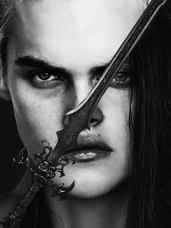
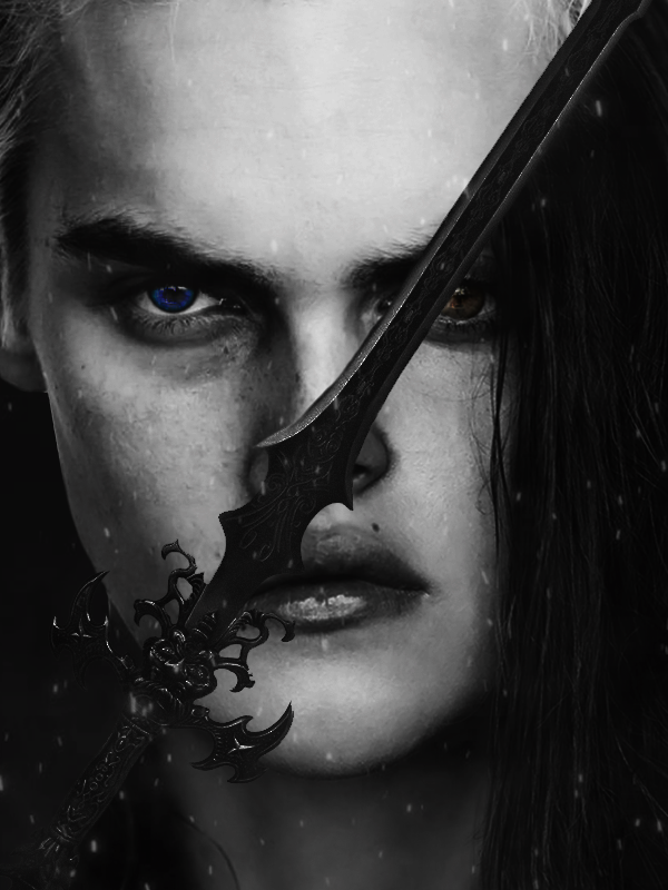
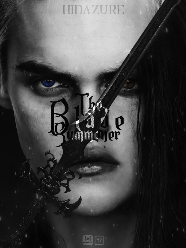
Tutorial #9
Fantasy Genre
Time spent: 2 hours
Total amount of sprites/images used: 6
STEP 1: Place desired images on canvas.
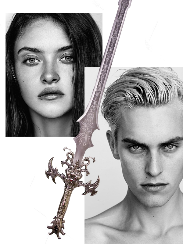
STEP 2: Resize images and clip the image of the girl onto a layer that has content on the bottom half of the sword so it splits half and half.
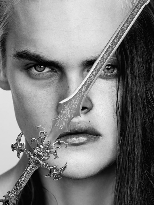
STEP 3: Touch up on things (like the rendering of the sword or turning the background of the guy a dark gray). Also add on a Brightness/Contrast adjustment layer to make the shades pop more.
STEP 4: Add on texturing (sparks for this one that reminded me of some cool magical effect) and eye color for the two. To achieve the color of the eyes, I simply found two images online with the shapes I wanted and cut out the irises. Then, I applied correction layers (Hue/Saturation and Brightness/Contrast and Tone Curve) to get the color I wanted, which was a very vibrant blue and a more toned down brown).
STEP 5: Add text! To make the words stand out, I applied a clipping mask onto the rasterized text layer and used the paintbrush tool to color the section of the words that touch the sword white. You could probably do the same effect with an adjustment layer, but I found clipping to be the easiest. Also put the layer on Overlay and duplicate to add some texture and glow. Use the Dodge & Burn tool to add more dimension and contrast in areas that are needed. As usual, the text is the final step.


yaoyueyi This is look so cool. Only problem is I don't think I'll be able to do it. I'll try though.
NatsumeRikka lol it took me 2 years of experience to get to where I am today. :') really this thread is more like a process than a tutorial since I haven't gone in detail on how all the adjustment layers and tools work and all that. it would be preeeetty difficult for a beginners to do this but like you said, you can always try! I also highly rec looking up actual tutorials and getting photoshop or a decent program if you don't have that already.
yaoyueyi I have installed a photoshop app, and I tried making a cover but the I'm completely confused about the tools there, so it didn't go very well. Can u tell me what app you use? I searched for photoshop cs4 but I found adobe photoshop. Is that it?
NatsumeRikka I use Photoshop CS6. CS4 is a bit outdated, but it will work. Adobe Photoshop is just a summary for all of them, I think. Took me about two months to get used to the photoshop interface though, so I'm guessing that it will take awhile for you too. Best advice is to watch tutorials-- that'll probably speed up the process.
yaoyueyi Okay, thank u
- Edited
This photoshop tutorial seems to be okay for beginners. The basic tools for CS4 should exist for CS6 www.youtube.com/watch?v=pFyOznL9UvA
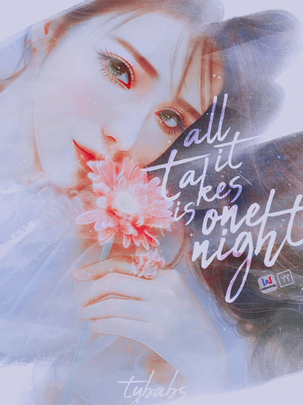
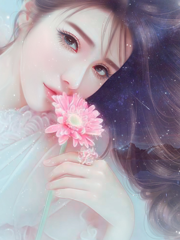
Tutorial #10
Romance Genre
Time spent: 1.5 hours
Total amount of sprites/images used: 3
STEP 1: Place desired images on canvas.
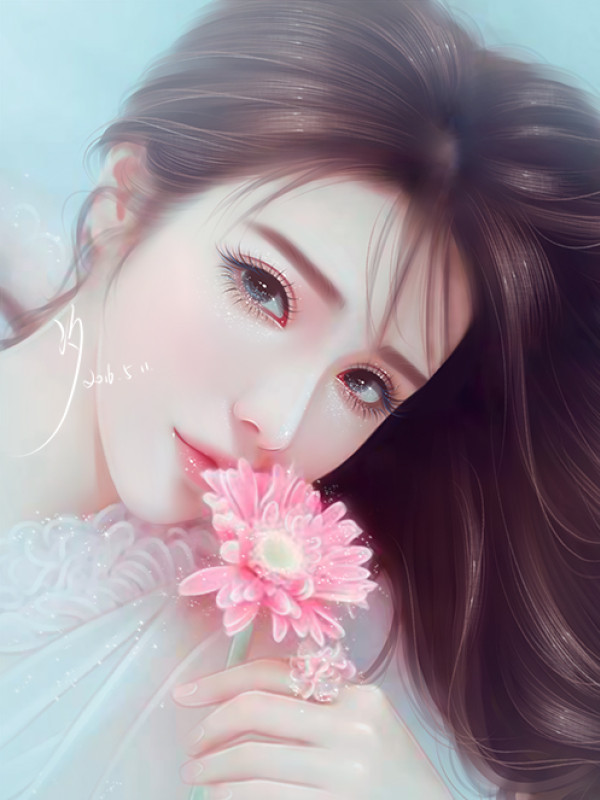
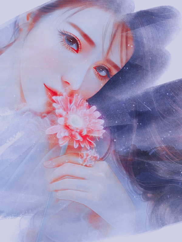
STEP 2: Position image, erase watermark signature w/ the smudge tool, and add on sky textures on Screen mode to get the star effect. Erase some of the texture where the face is to limit it to the hair.
STEP 3: Apply PSD coloring, Selective Color adjustment layer, and Brightness/Contrast adjustment layer to get the color you want.
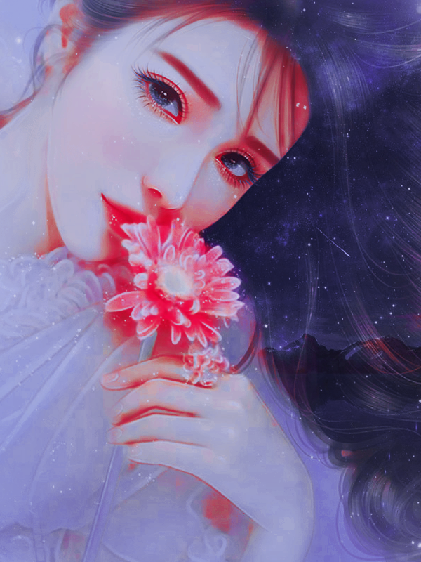
STEP 4: Add on watercolor texture and clip the girl sprite on it. Then, add on more watercolor texture over the sprite to give even more texture.
STEP 5: Add on text. As you can tell, I also added on a Color Balance adjustment layer because I decided that yellow would look nicer.