- Edited
Great Expert, can This Fish ask a question?
I won't wait for your reply (☉ε ⊙ノ)ノ
Can these Great Arts be used in Krita?
Edit: This is Krita btw https://krita.org/en/
Great Expert, can This Fish ask a question?
I won't wait for your reply (☉ε ⊙ノ)ノ
Can these Great Arts be used in Krita?
Edit: This is Krita btw https://krita.org/en/
DaddyFishGotBigPp uhh probably? I personally don't know bc I've never used the program but you can try haha. that probably doesn't help very much but that's about all I can tell you.
yaoyueyi Neh, too lazy. Just gonna try to complete the prologue and a few more chapters and ask Granddaddy You to make one for me ಠ‿ಠ
That is probably gonna take a few years, so no worries... ;-;
DaddyFishGotBigPp sure, good luck with writing! :)
Time spent: 1.5 hours
Total amount of sprites/images used: 3
Step 1: Place desired image on canvas.
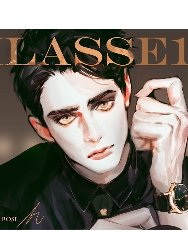
Step 2: Rotate image and remove background with the quick select tool + eraser tool.
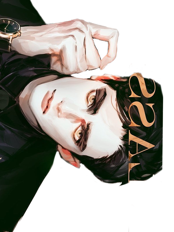
Step 3: Remove undesired text over hair with the smudge tool. To get a really great texture, follow the directions of the strands of hair and make the smudge tool as small as possible. Use the yellow left over from the text as color complexity/highlights. Also, extend the hair with the same tool to create more volume.
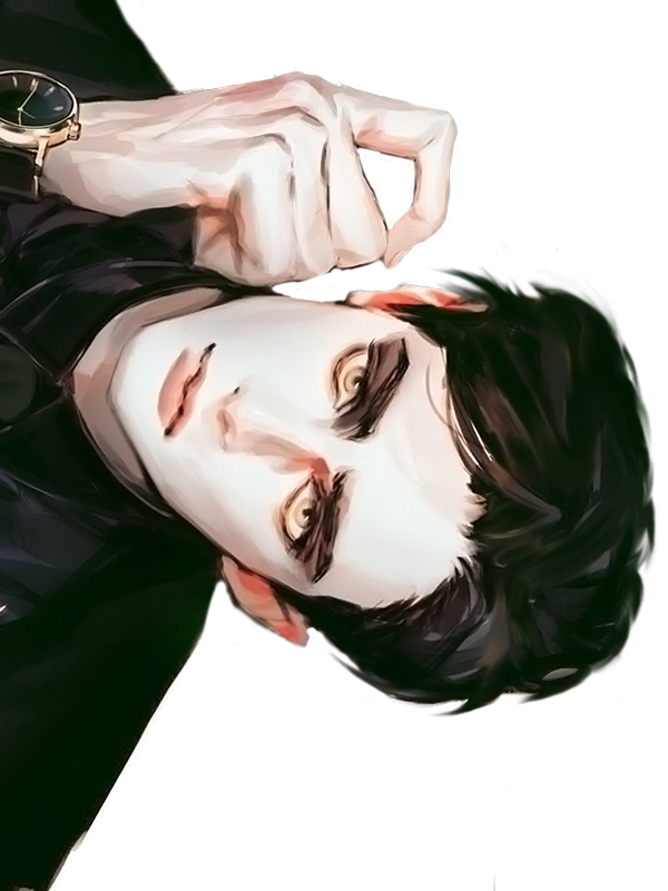
Step 4: Using one single image of a row of chains, duplicate and rotate to create an entire background of chains. The reason why I decided to duplicate the chains instead of finding a background of chains online was because I wanted to be able to fully customize what it looked like.
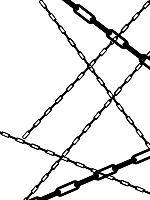
Step 5: Use the Gradient Overlay blending option on each individual chain layer to add dimension. I set the gradient to a black and white one.
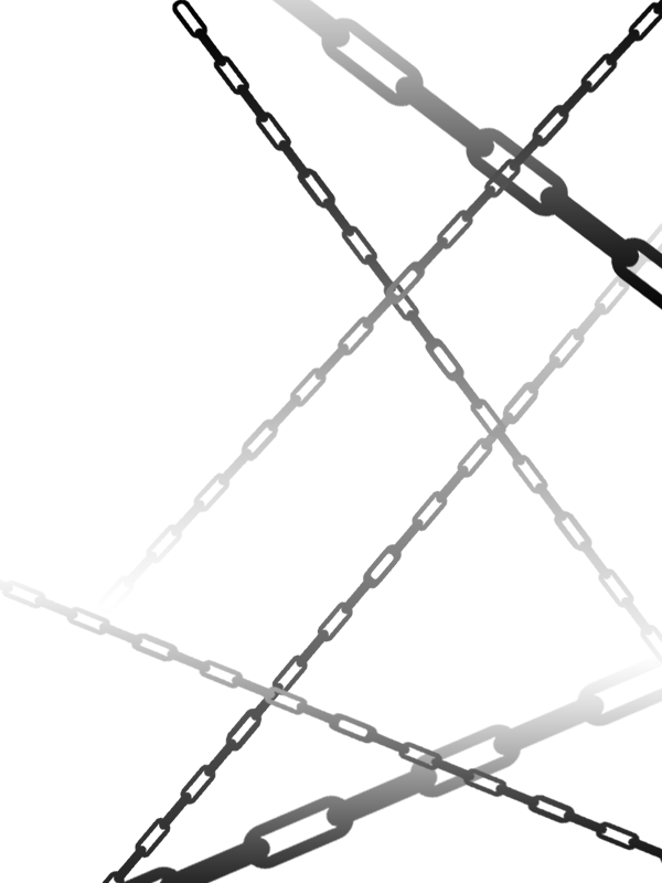
Step 6: Add PSD coloring to sprites and add a geometric background as well.
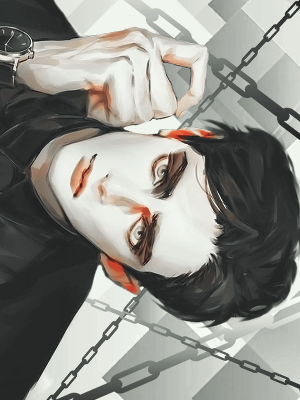
Step 7: Add text (on the Difference mode) and voila.
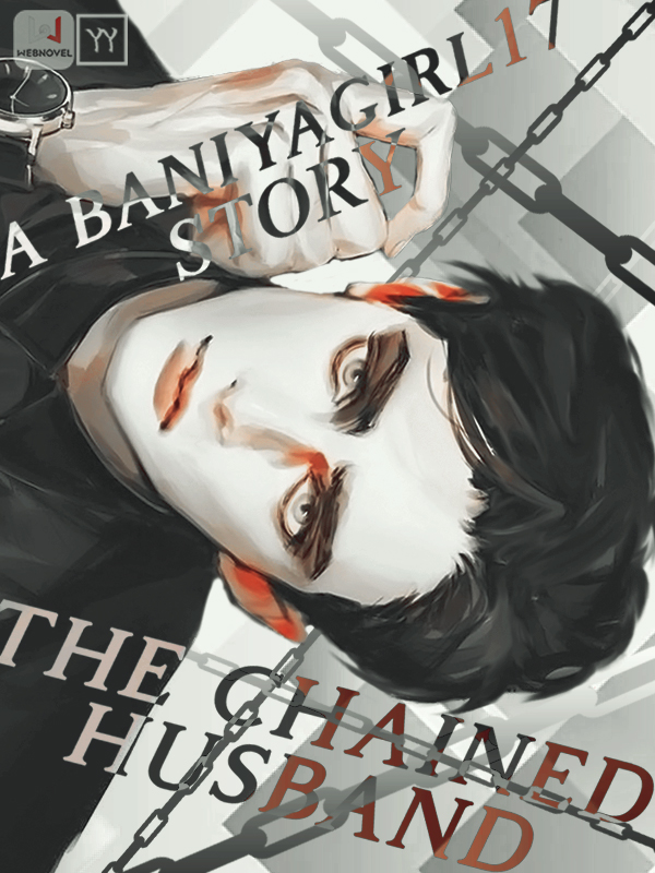
Time spent: 2 hours
Total amount of sprites/images used: 4
STEP 1: Place desired images on canvas.
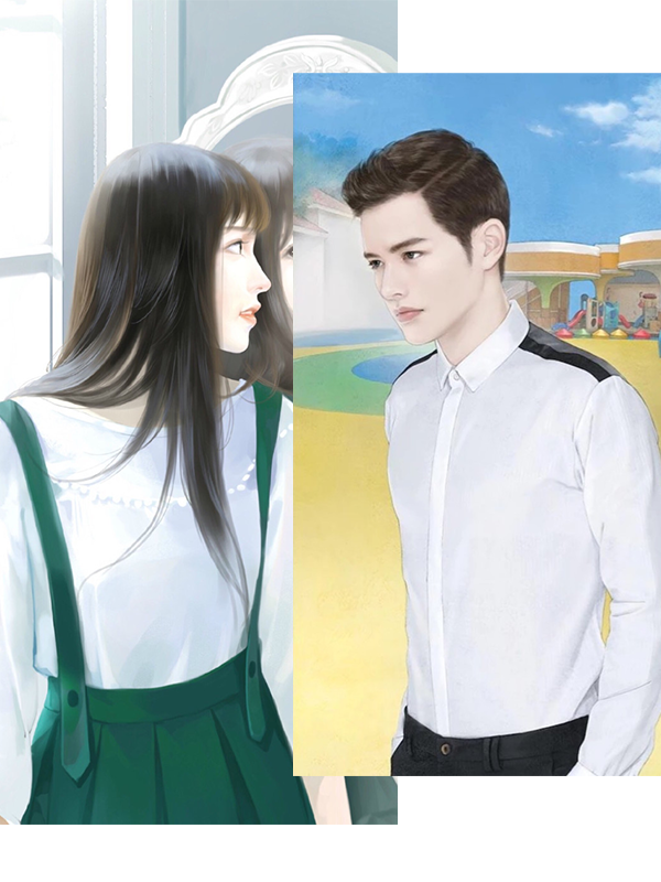
STEP 2: Remove the background of the images with the quick select tool + the eraser tool. Then, resize and position them.
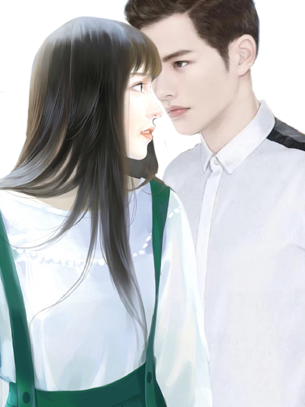
STEP 3: Add in a background and use the Crosshatch filter in the Filter Gallery to apply texture to them.
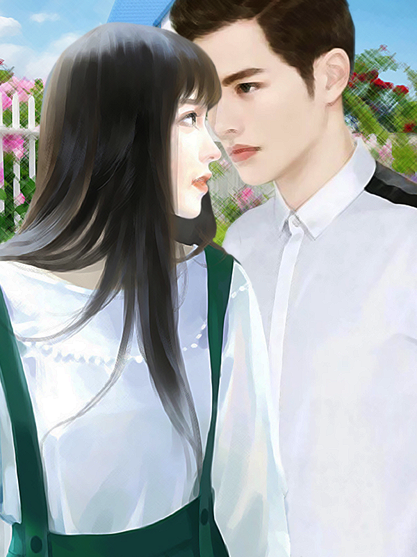
STEP 4: Apply PSD coloring and find a picture of a poppy flower to match the color scheme. Duplicate and resize the poppy flowers to create a border.
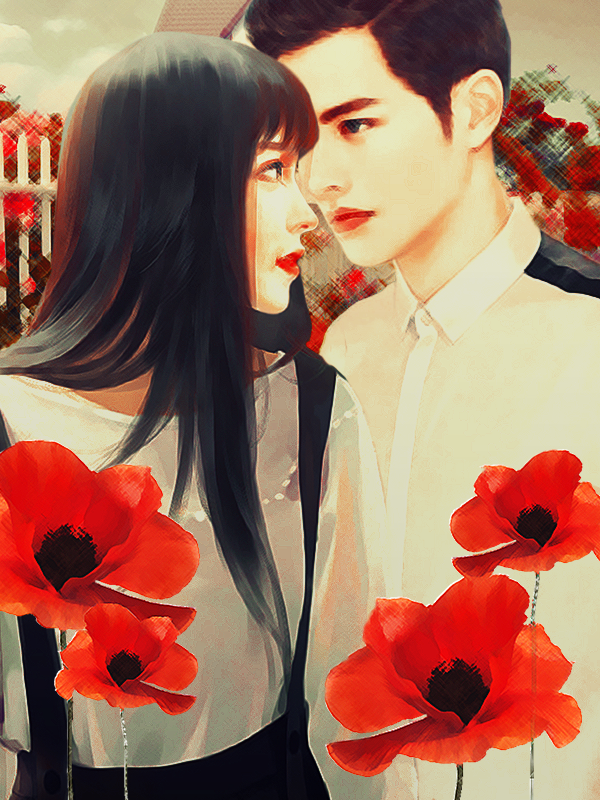
STEP 5: Add on text and other textures. This is by far the most time consuming step because I had to figure out how I wanted to arrange the text. It was hard getting an idea because of how the flowers were positioned and the darker tones on the female render. In the end, I decided on using a bunch of watercolor brushes that I downloaded to add on the texture and make the text (which is some layers on multiply, others on color burn, and others on overlay + motion blur filter). This is also the finished product!
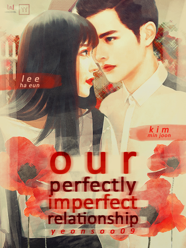
Reinesse oh lol I highkey really hate webnovel translated (and some original fic) covers /no offense/ bc of that. it's such a lazy style (which really makes all the posters look the same) and I really think that if they're using these story covers to represent fics on a site with millions of readers, they need to up their graphics game. it's an okay style to me if they were made by a beginning graphics designer-- or like in your case, someone who lacks a proper program-- but I don't think that it's okay for such a big site like webnovel.
in fact, I wrote an entire rant about how terrible the webnovel covers are but I'm too scared to post it bc I feel like some important webnovel staffs or smth are going to get triggered by it :joy:
yaoyueyi I am really impressed with each of the above. Omg!! It's really time process, you spend almost 2 to 3 hours on each cover even considering the likes and dislike of each and every person.you even do it for free.
Really great works and I would really appreciate you for making each and every cover adorable.
I think i yould spend my whole time in looking those tutorials and also your great work.


Oh, so that's how the covers were made...
I assumed everyone knew how to draw. I don't have Photoshop, so I had to draw my own cover from scratch lol. >3</
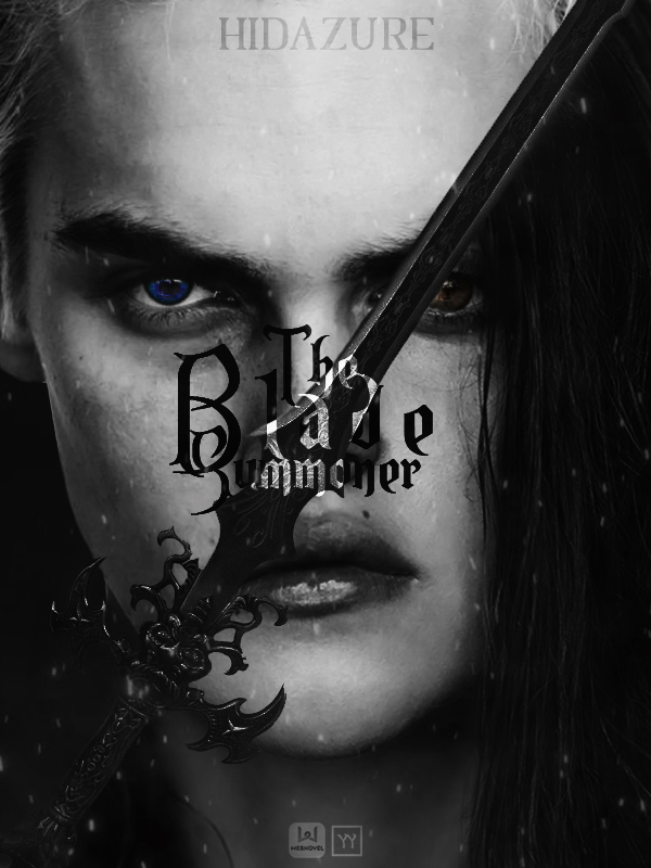
Time spent: 2 hours
Total amount of sprites/images used: 6
STEP 1: Place desired images on canvas.
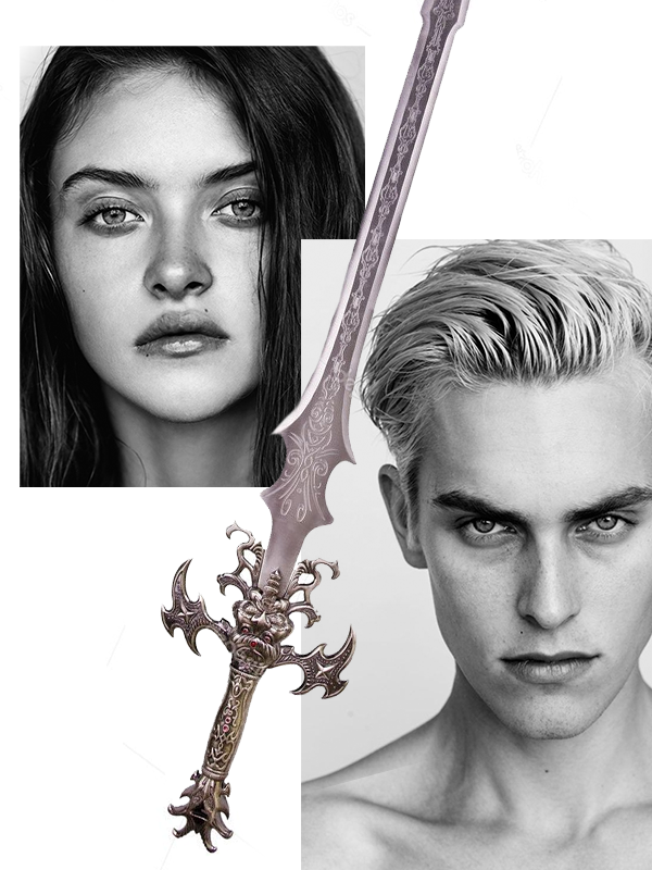
STEP 2: Resize images and clip the image of the girl onto a layer that has content on the bottom half of the sword so it splits half and half.
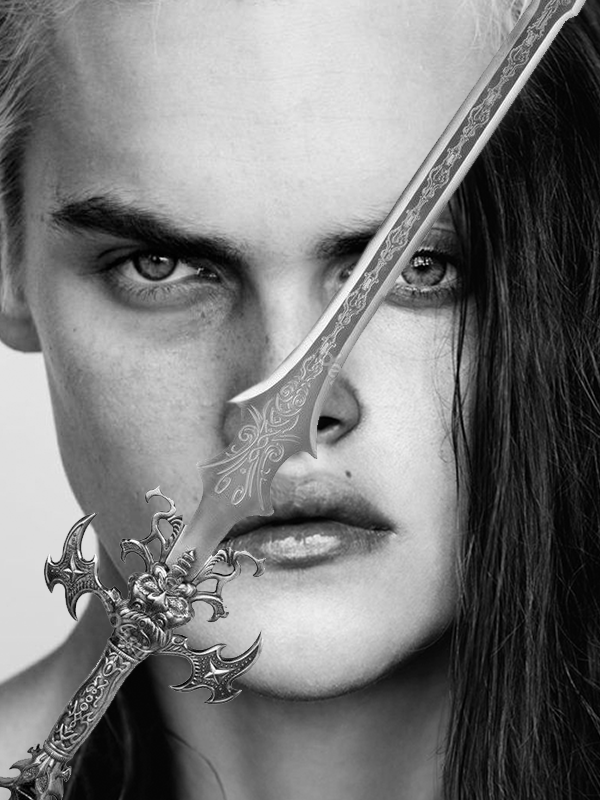
STEP 3: Touch up on things (like the rendering of the sword or turning the background of the guy a dark gray). Also add on a Brightness/Contrast adjustment layer to make the shades pop more.
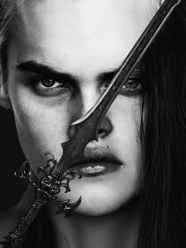
STEP 4: Add on texturing (sparks for this one that reminded me of some cool magical effect) and eye color for the two. To achieve the color of the eyes, I simply found two images online with the shapes I wanted and cut out the irises. Then, I applied correction layers (Hue/Saturation and Brightness/Contrast and Tone Curve) to get the color I wanted, which was a very vibrant blue and a more toned down brown).
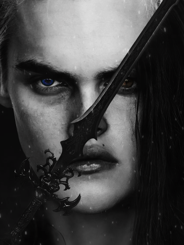
STEP 5: Add text! To make the words stand out, I applied a clipping mask onto the rasterized text layer and used the paintbrush tool to color the section of the words that touch the sword white. You could probably do the same effect with an adjustment layer, but I found clipping to be the easiest. Also put the layer on Overlay and duplicate to add some texture and glow. Use the Dodge & Burn tool to add more dimension and contrast in areas that are needed. As usual, the text is the final step.
yaoyueyi This is look so cool. Only problem is I don't think I'll be able to do it. I'll try though.
NatsumeRikka lol it took me 2 years of experience to get to where I am today. :') really this thread is more like a process than a tutorial since I haven't gone in detail on how all the adjustment layers and tools work and all that. it would be preeeetty difficult for a beginners to do this but like you said, you can always try! I also highly rec looking up actual tutorials and getting photoshop or a decent program if you don't have that already.